
- 1,594
- Posts
- 17
- Years
- Age 11
- Ontario, Canada
- Seen Dec 19, 2016
I wasn't here for a while! :D
Anyways, Here's teh banner I made. Princess Be Careful RAWKS! :D
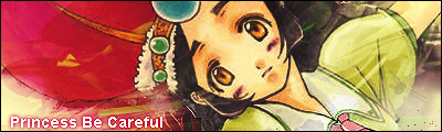
Err... Rate pls. thx.
so i made a new sig(atleast an attempt to :P )

i'm still working on it so it isn't done yet
but what do you guys think of it ??
tips or rate please (both is even more appreciated)
Hokay I made this button a while ago and I was wondering what you guys thought of it. BTW E is for El Capitano.

And I made this signature.
All of these people basically just broke the new rule that will be in the new thread. If you don't rate the one above, you cannot get yours rated.
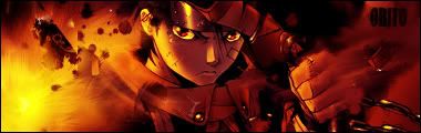
@Sasuke_Darkness: I love the signature, but the render looks a bit too cluttered. Try doing just Naruto's face, but not too big. 9/10.
@Ryouki: I like it. It all blends really well together, except the text kinda stands out a bit more than anything else. 8/10.
@Hitsugaya: It looks sort of the same as your first one. Try to use different colors and do some brushing. Brushing can make the banner amazing. 7/10.
@El Capitano: The signature blends altogether really well. But it took me a while to try to find the text, it's hidden, which is cool if you want it like that. 8.5/10.


